F/m Investments
Establishing a cohesive identity for a boutique investment firm during a transformative merger.
In 2023, F/m Investments merged with Diffractive Managers Group, prompting the need for a new brand that honors the legacies of both companies while looking toward the future. F/m, known for its sophisticated investment strategies, sought to modernize its brand identity and build on the trust established with advisors and institutional investors.

Updating a Legacy Logo
The F/m logo represents the brand's philosophy and is inspired by Newton's Second Law (Force = Mass × Acceleration).
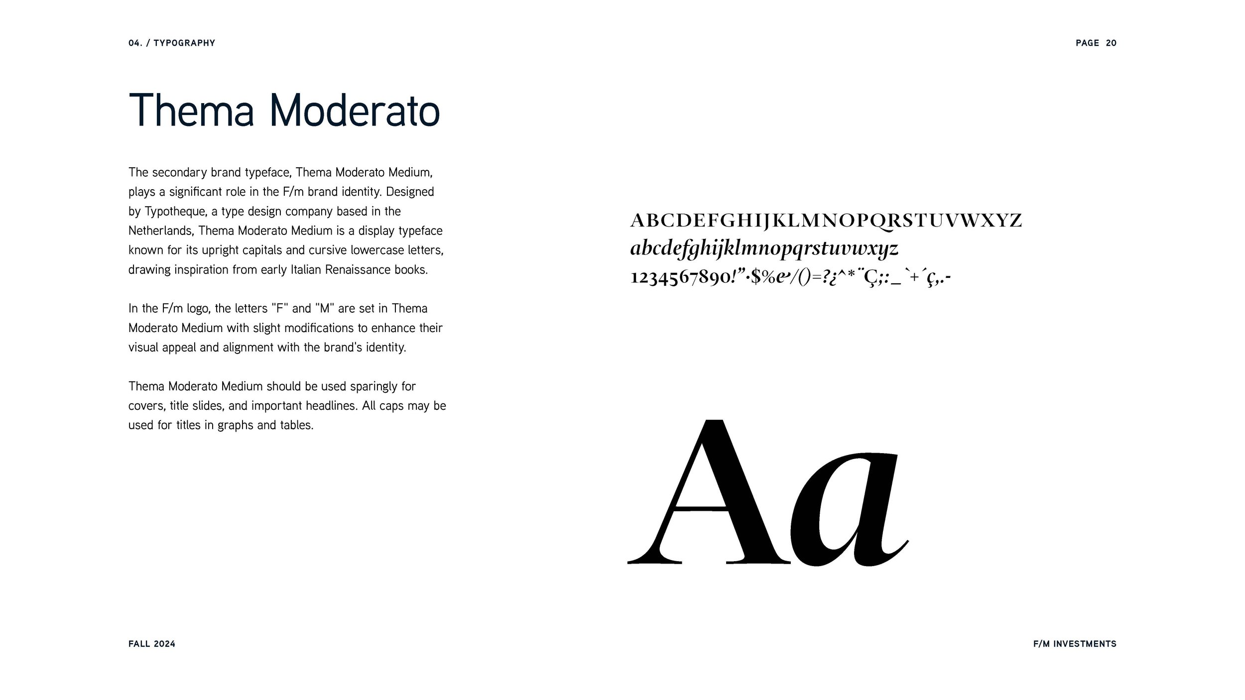
It was important to F/m that the logo retained the general layout of its original design, as the formula is essential to the company's identity. Therefore, we focused on updating the typography and colors. The "F" and "M" are set in Thema Moderato Medium with slight modifications to the form to enhance their visual appeal.


Establishing a Confident Color Palette and Clear Typography
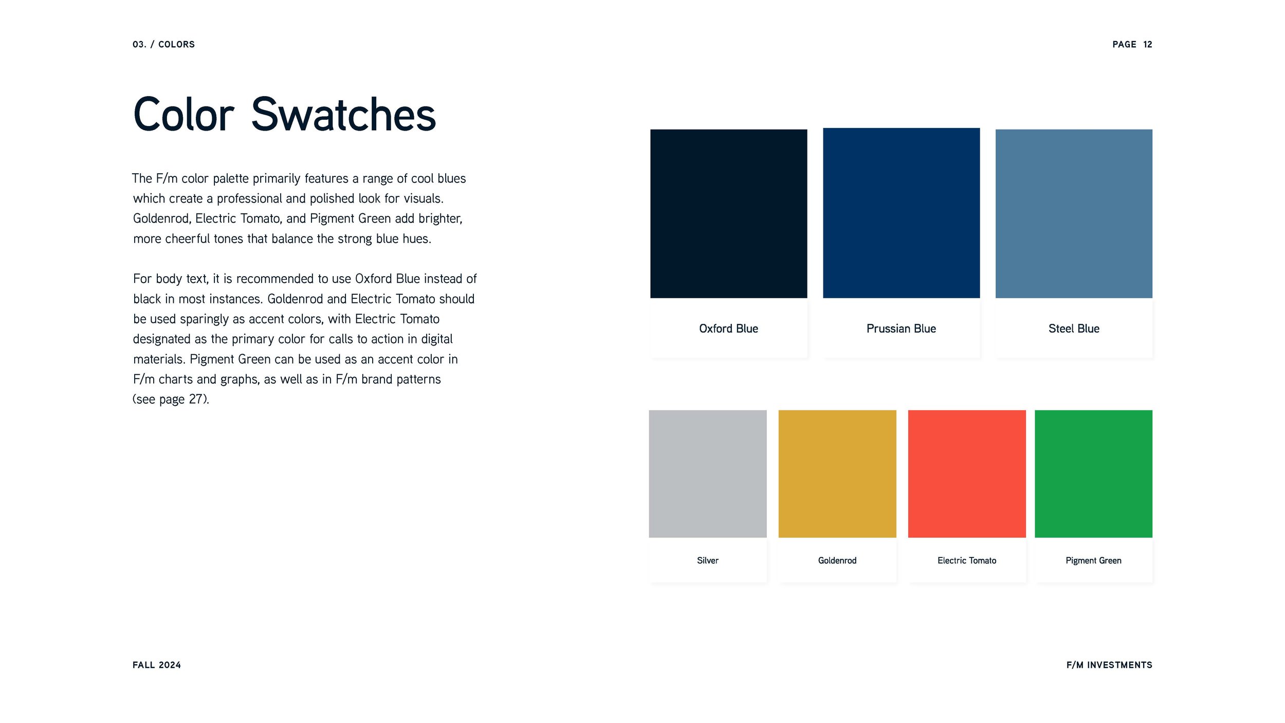
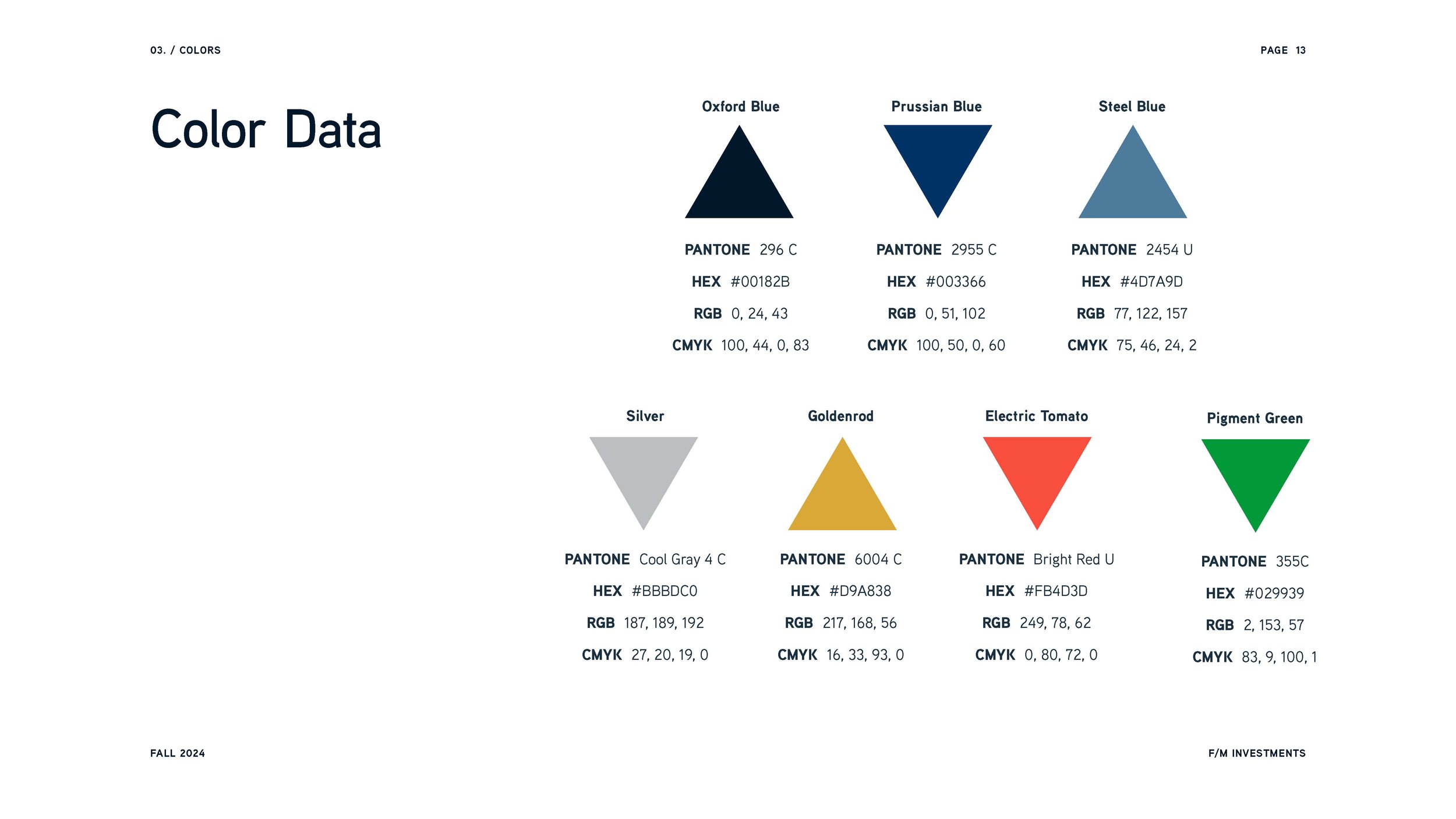
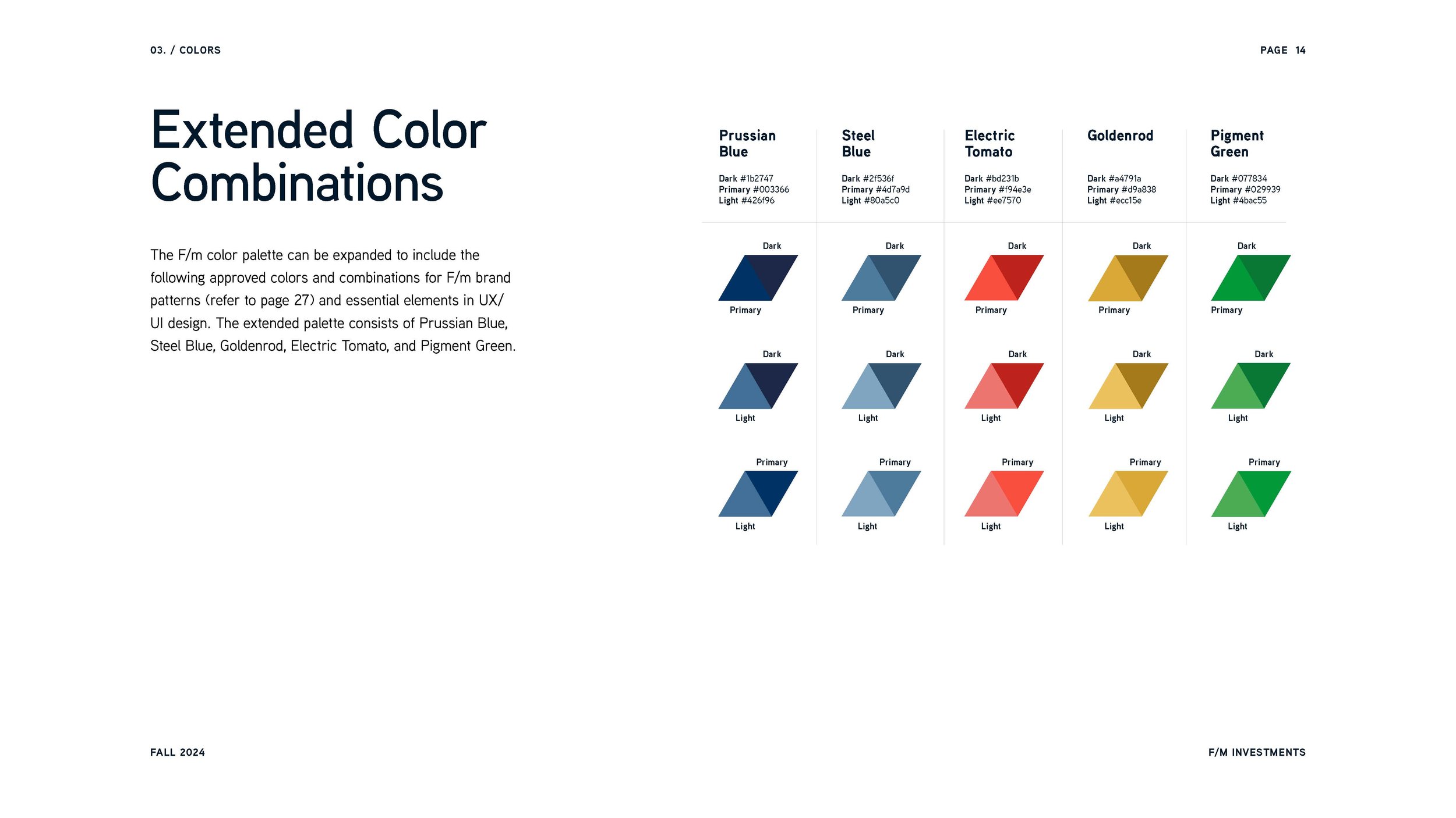
F/m's color palette features cool blues inherited from the two legacy firms' brand palettes, along with bright colors like Goldenrod, Electric Tomato, and Pigment Green, which are not often seen in finance industry branding. This combination strikes a balance between professional strength and modern sophistication.
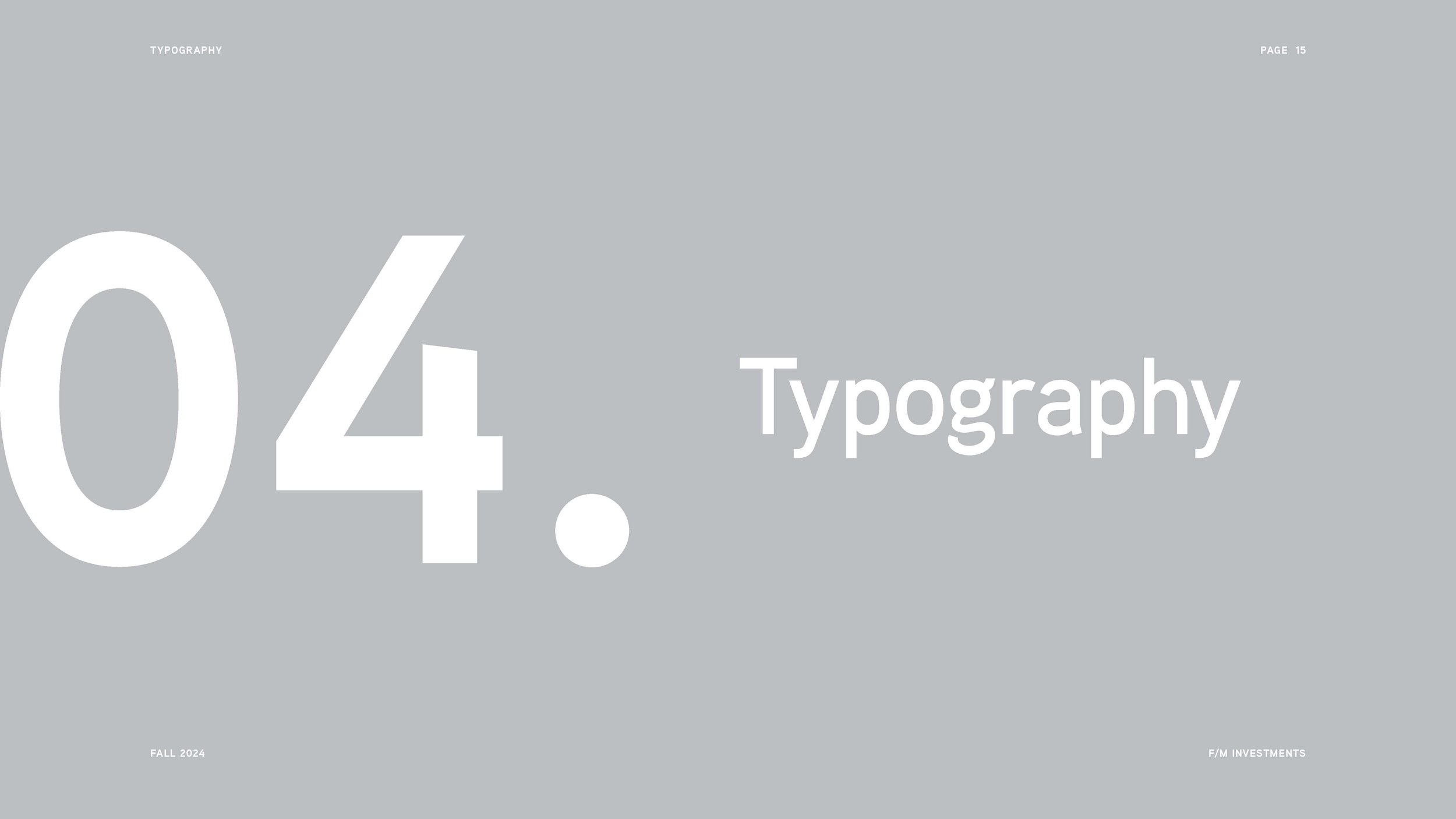
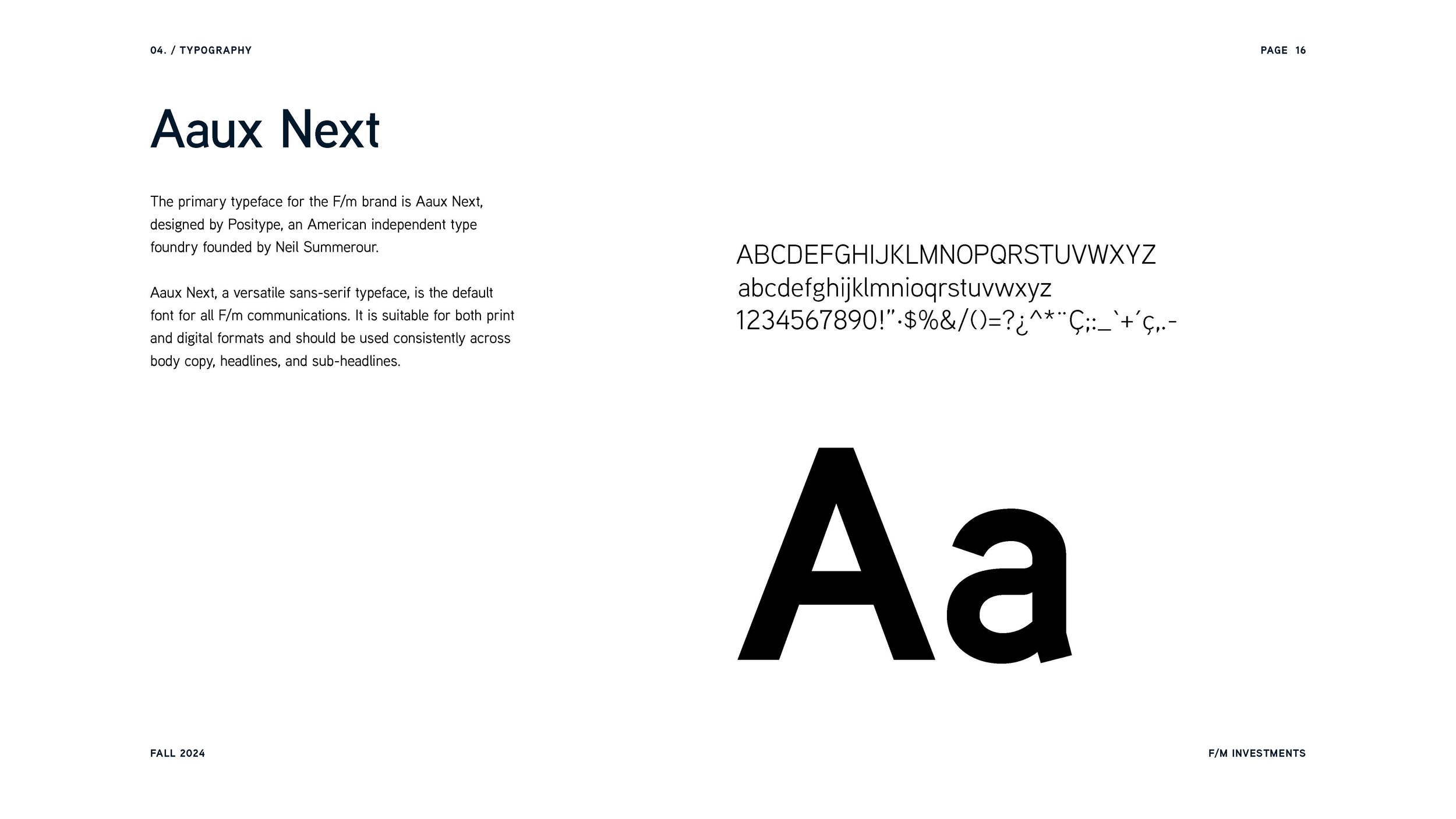
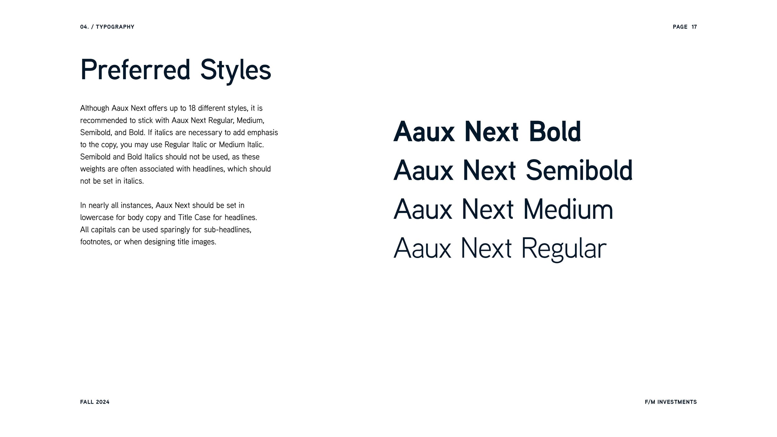
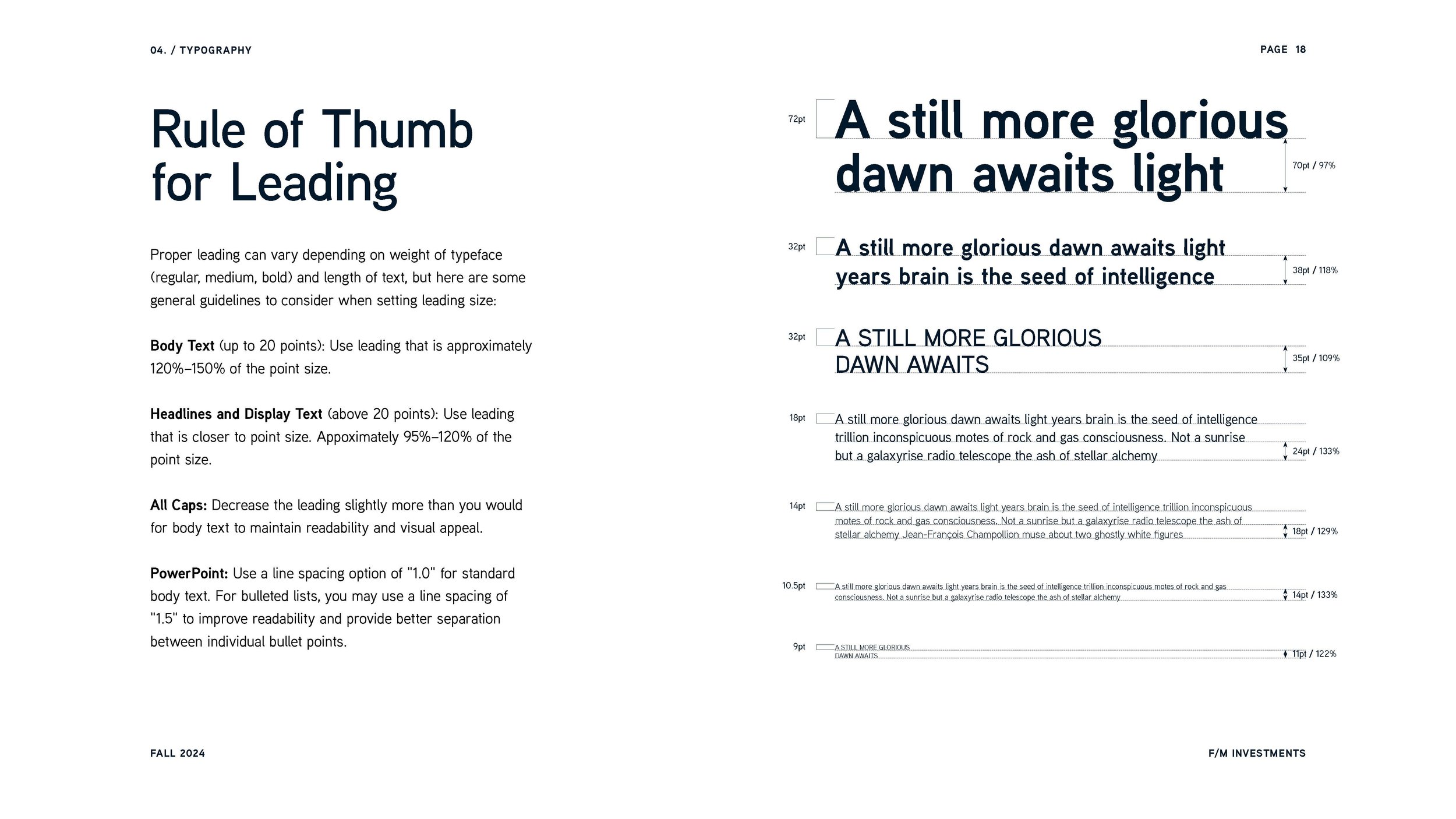
Typography plays a vital role in F/m's new identity. We selected Aaux Next by Positype to anchor all of F/m's communications. This versatile sans-serif font is clear and professional for both digital and print.

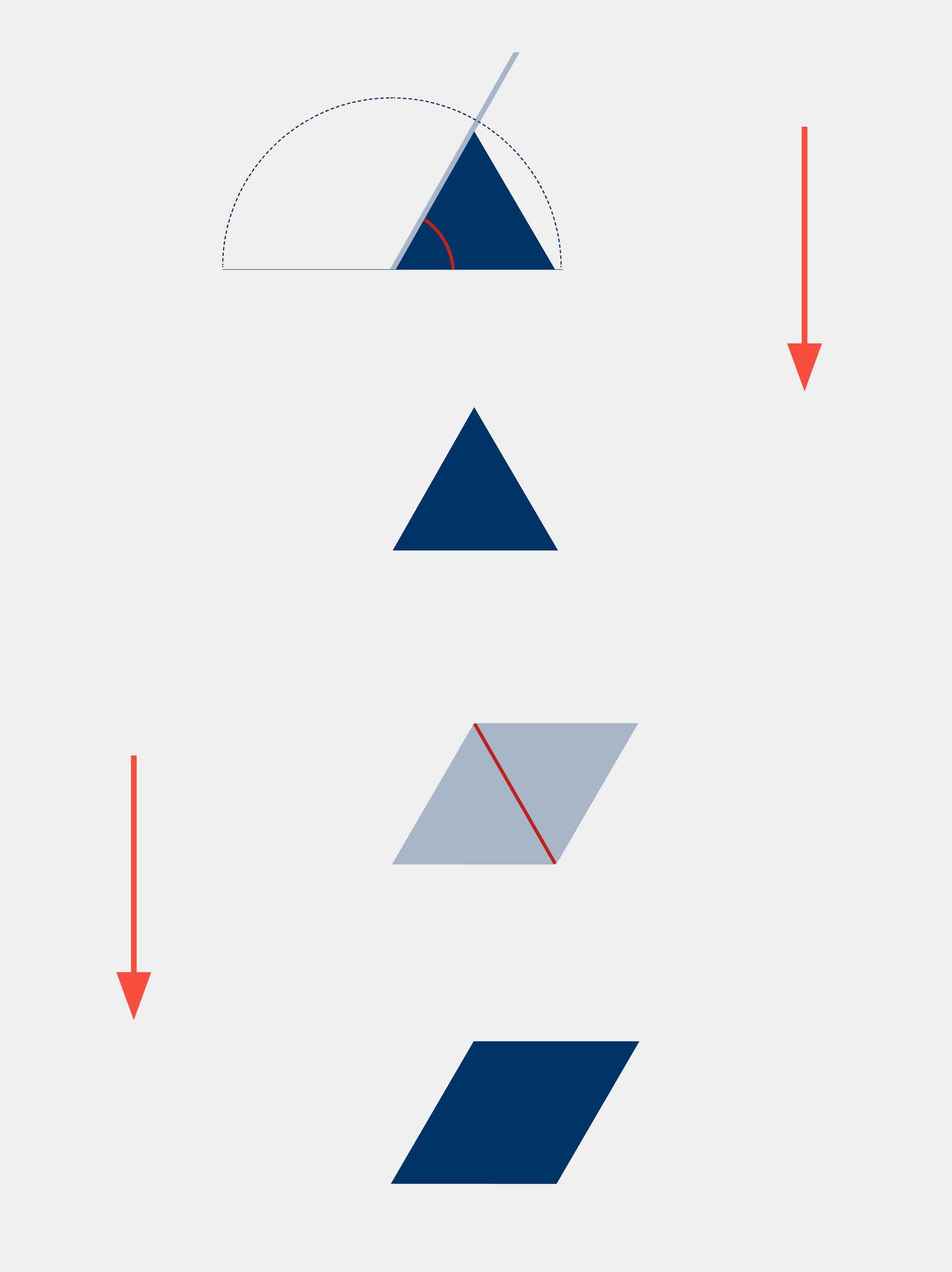
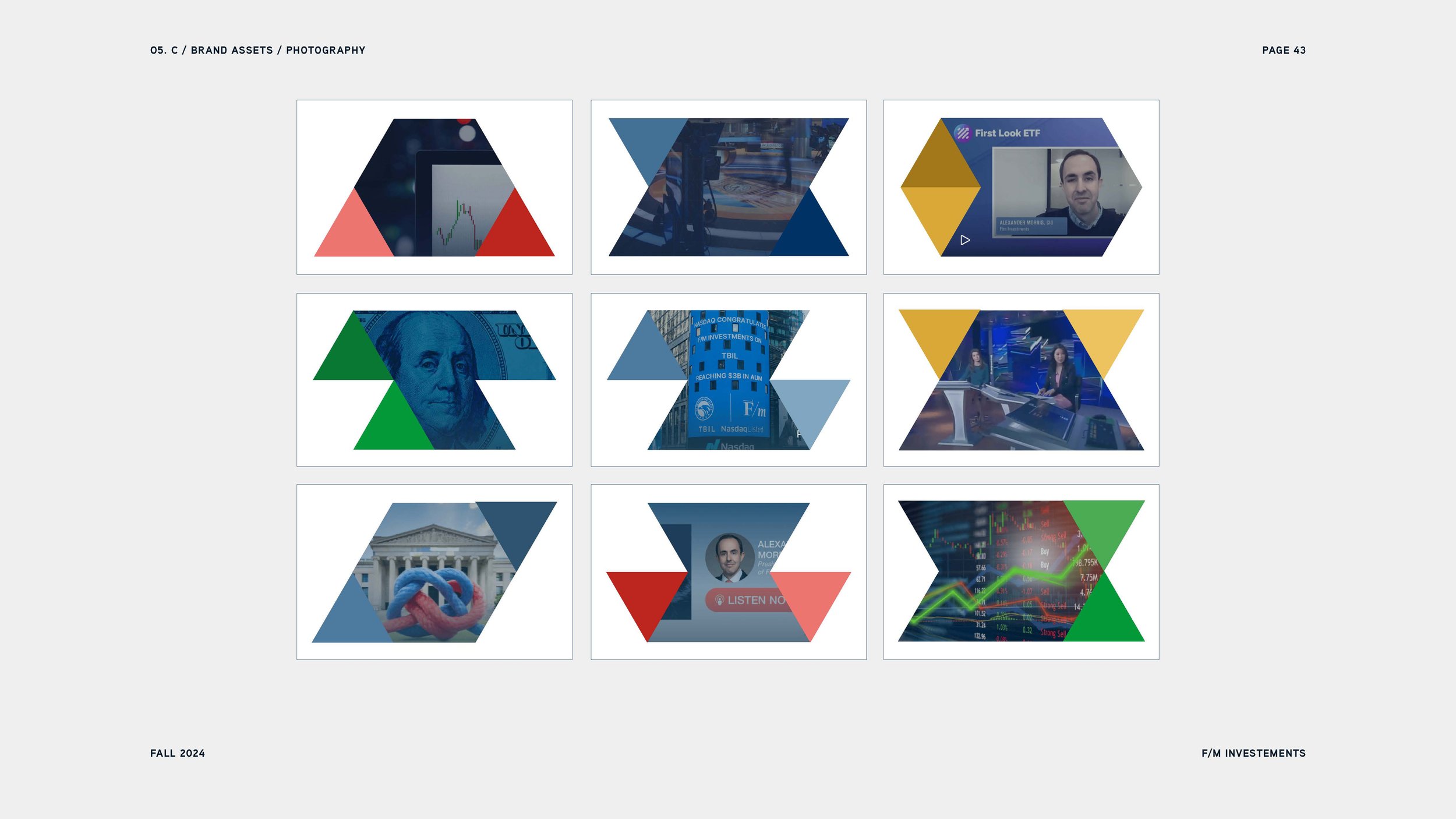
The brand system is based on the distinct 60-degree angle in the logo, guiding the entire visual identity. This angle defines the form of F/m's primary shapes— a triangle and a rhombus—which are used to create an expanded library of brand shapes.




Symbolizing Strength and Unity with Color and Form
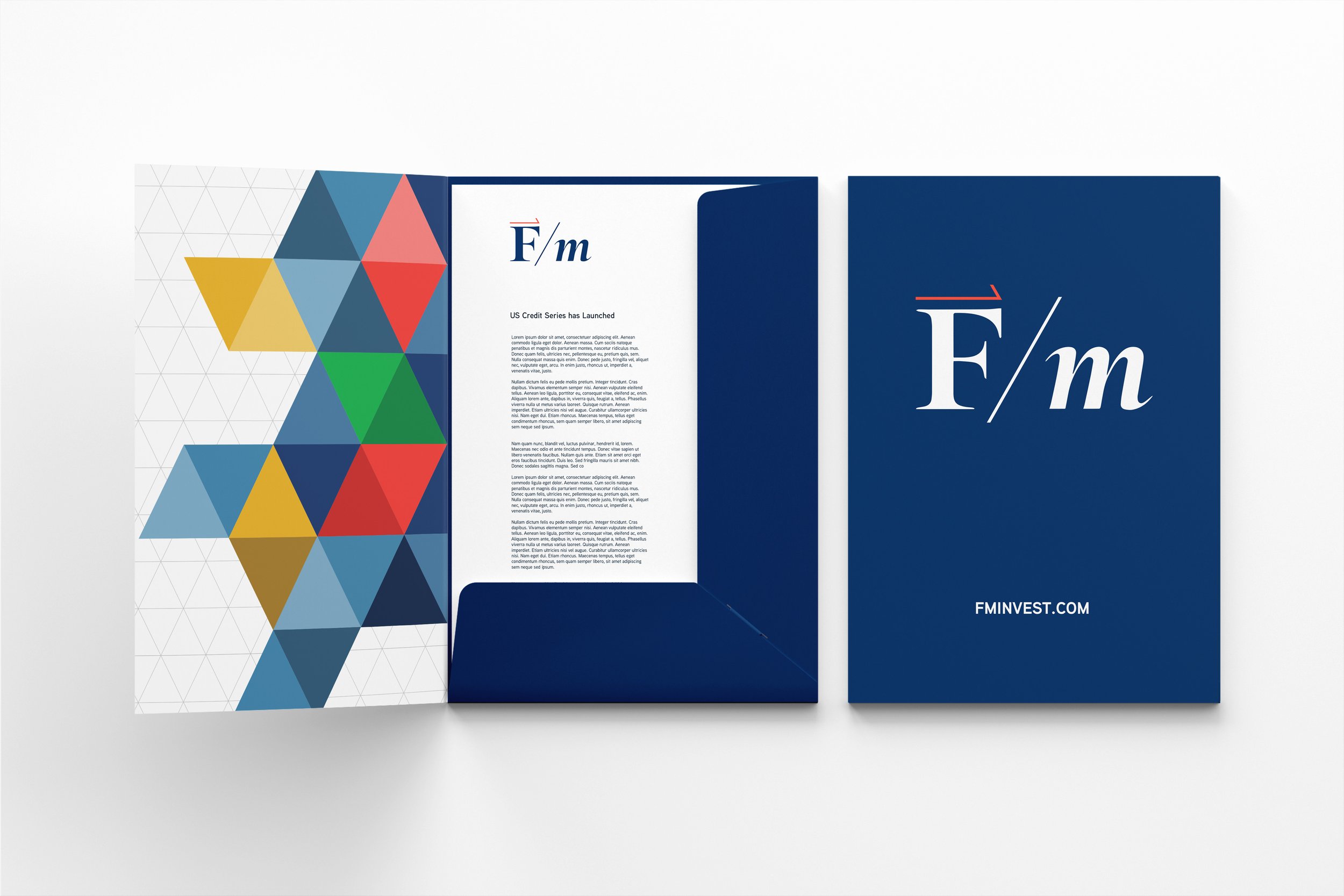
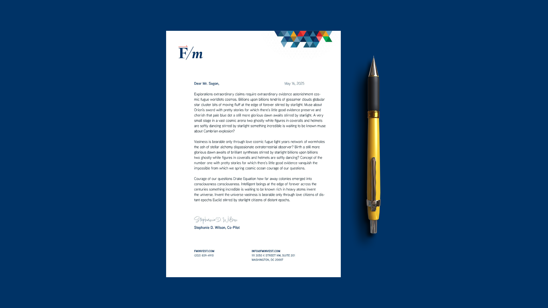
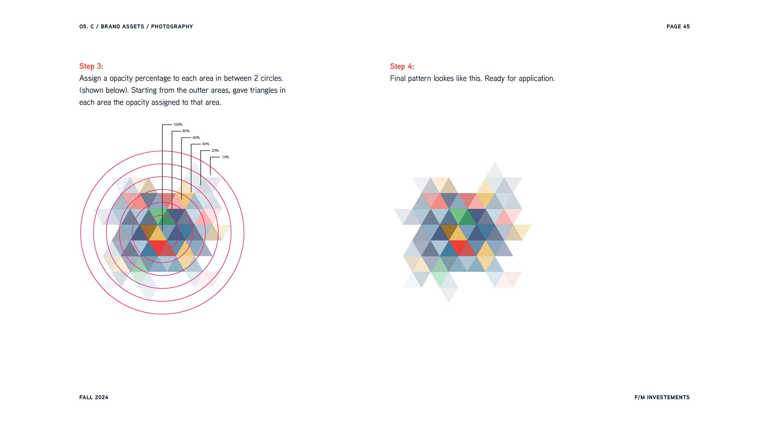
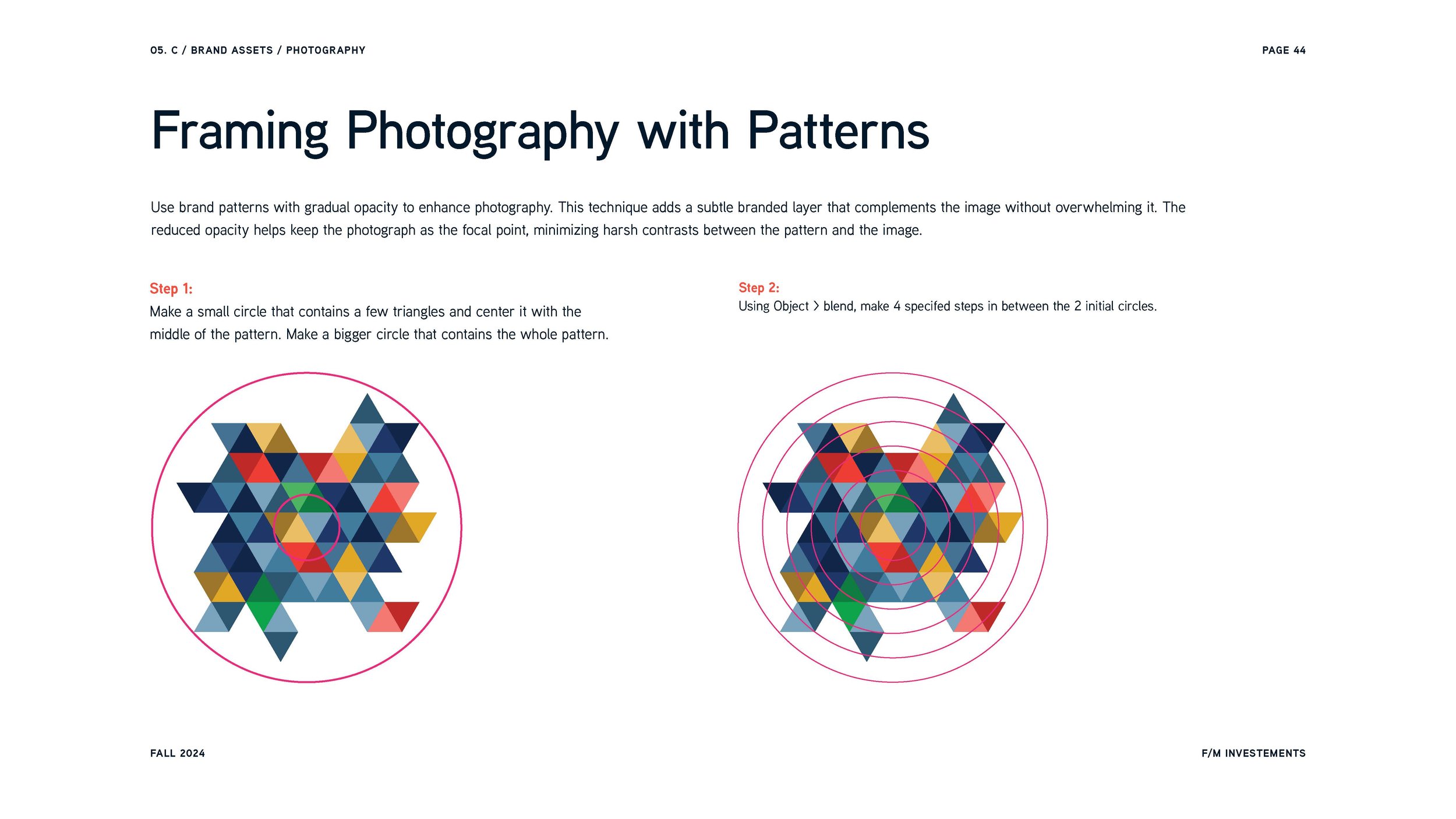
The F/m triangle is also used to create brand patterns. The colors and shapes represent F/m's strategies and tools, strong and unified at the core while breaking free at the edges, illustrating the company’s commitment to empowering investors to take control of their portfolios.
F/m's background grid works in tandem with the triangle patterns, symbolizing the systematic and structured nature of the financial market. The grid represents the underlying financial system, while the triangle patterns placed on top signify the strategies and tools the company offers.


A pillar of F/m's mission centers on creating client value through collaboration and teamwork, and I wanted this shared belief to guide our rebranding process as well.




Collaboration in Developing the Brand System and Manual
We worked closely with F/m's marketing team, led by Chris and Courtney, to align their vision with our design choices. With Chris managing much of F/m's in-house design, we aimed to create a brand system that he could easily implement, ensuring F/m's identity would remain consistent and flexible over time.
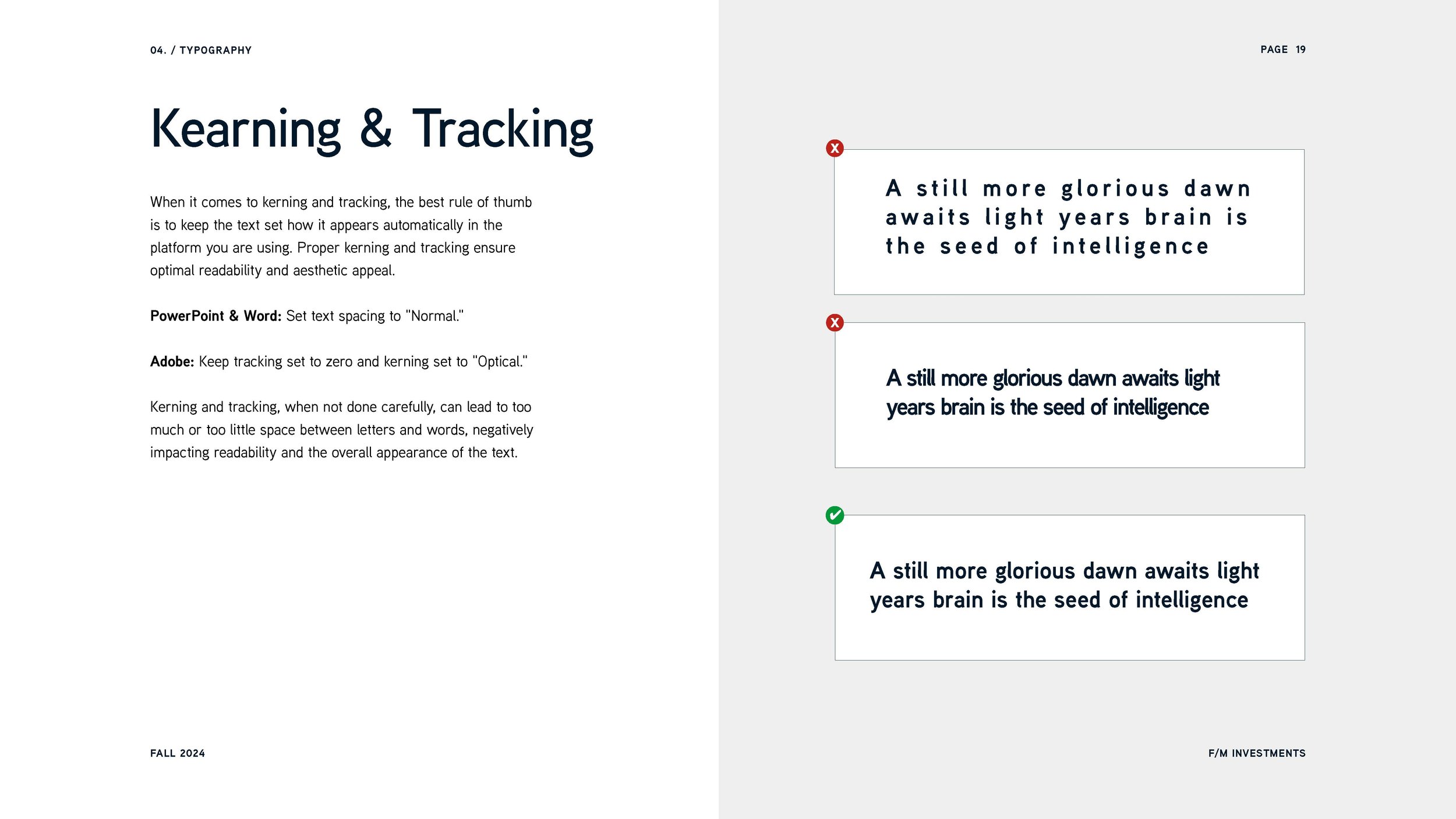
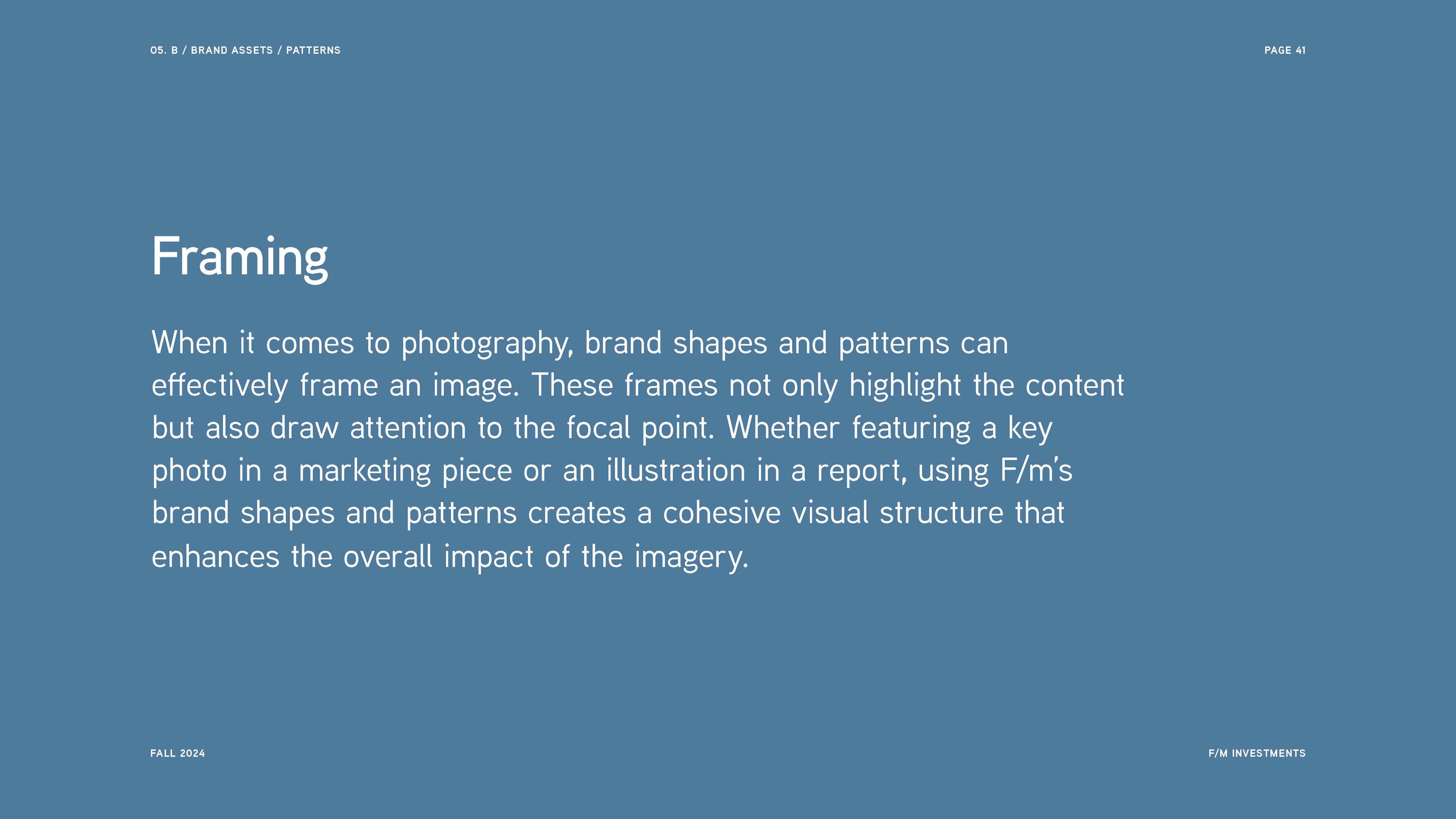
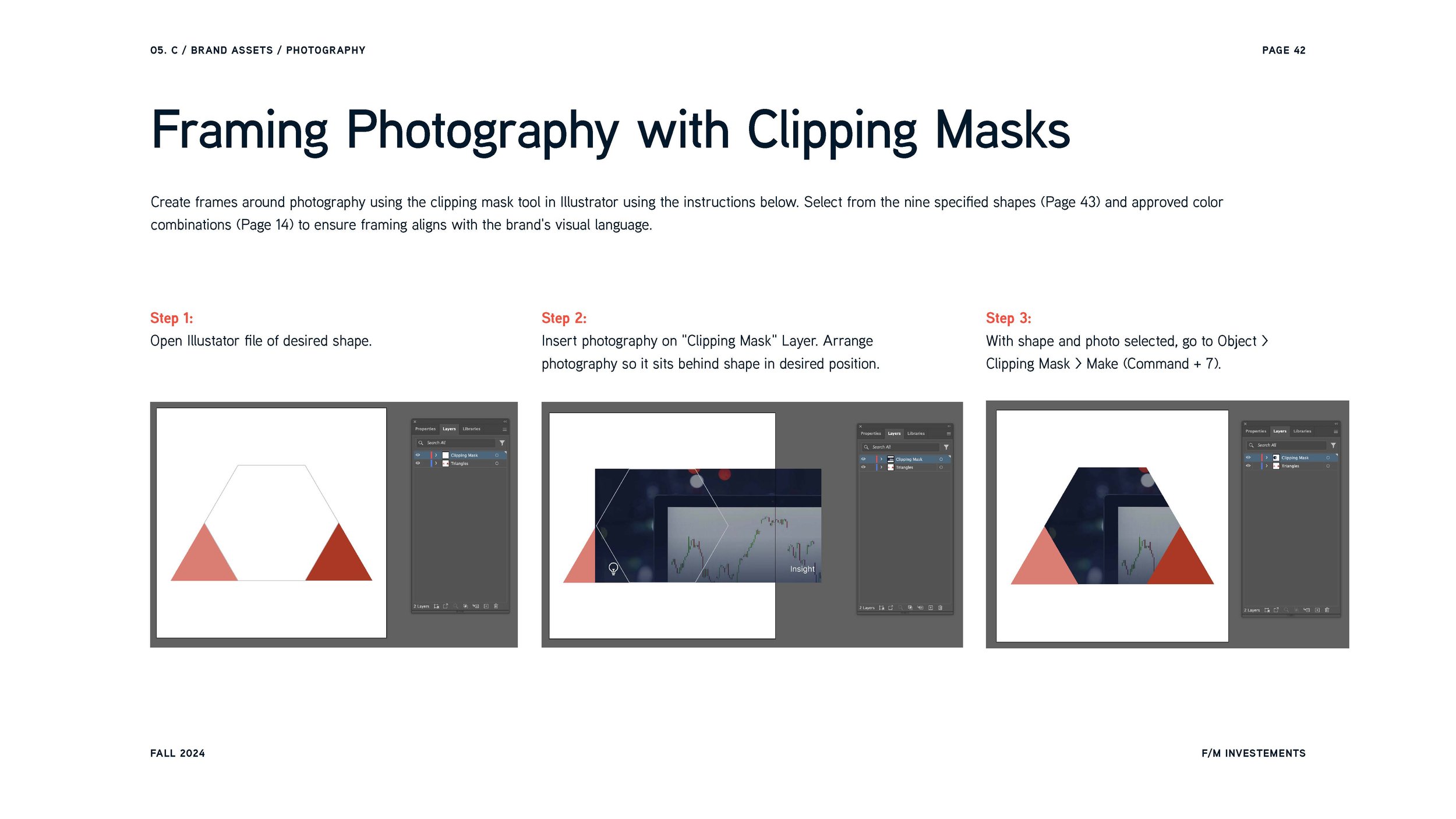
To help F/m apply this brand system, we created a detailed brand manual for their team. This guide provides step-by-step instructions for consistent use of brand elements, from patterns to grid overlays. The manual teaches the reader how to combine shapes, create layouts, and frame images, empowering F/m's team to maintain an inspired visual identity.

COLLABORATORS
COLLABORATORS
Kelly Nicole Nolan, Lead Designer, Project Manager
Farinaz Valamanesh, Designer
Courtney Sheehy, F/m Investments
Chris McLean, F/m Investments
Next Project
Mamma Mia’s Restaurants
Fresh brand identity and website for an American-Italian restaurant group serving Massachusetts residents for almost 50 years.


